Home Fitness App
Duration 15 weeks, SEP—DEC 2019
Project Type UI/UX Design, Graphic Design
Tools Adobe XD, Adobe Illustrator, Figma
The objective of this project was to create a personal training app.
The 1st phase of the project should be designed for either mobile, tablet, or PC use. The 2nd phase is a companion solution using newer technology, such as a smartwatch, TV, or AR.
Project Goal
Design a fitness app for people who prefers exercising at home with limited access to exercise equipments
First Week
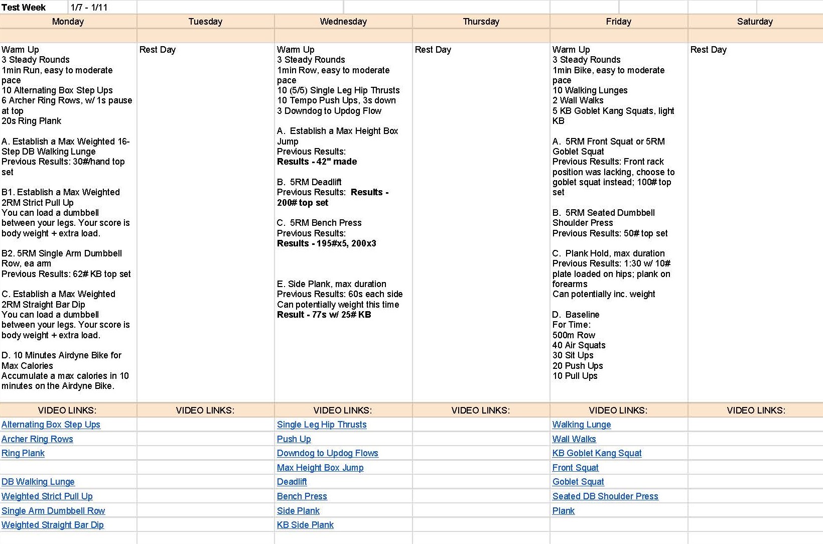
An RIT wellness coach, James Whelan was invited to the class to share his experience as a personal trainer. Through that Q&A session, we were able to understand how James set up the exercise routine for his clients, and how he shares the routine with them. Other than that, we also learned how James would adjust the difficulty of the next routine depending on how the client is doing.
James's routine was created in a Microsoft Excel document. The spreadsheet would show what the client needs to do each day. At the bottom of the spreadsheet were some links to videos if the client doesn't know how to perform the exercise listed.
Research
I visited the RIT gym to observe how it would feel to work out in a gym, and how others might feel during their workout session.
At first, it felt awkward and anxious to walk into the gym. It also felt like everyone or someone is silently judging what you're doing. Occasionally, it felt embarrassing when I had to look up how to use a specific equipment, whether on Google or looking at the instructional diagram provided on the equipment.
I noticed that people usually stuck with types of equipment they are familiar with in order to avoid feeling out of place.
Pros
Very detailed
Helpful to have the Youtube links
There's a system
Cons
It's frustrating to repeatedly open up the spreadsheet while in the gym, it breaks the flow of the workout
If the user uses a timer, they would have to keep switching between the 2 screens/apps
User has to scroll down and back up again to see if there's a video link available for the workout they're doing. Not all exercises have a link
Links are not located next to the workout, but in a different section below
Competitive Analysis
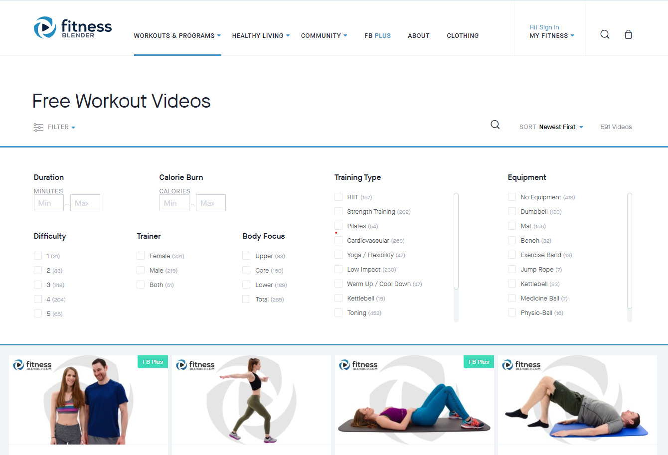
I identified 2 fitness apps and 1 fitness site and compared their functionalities and differences.
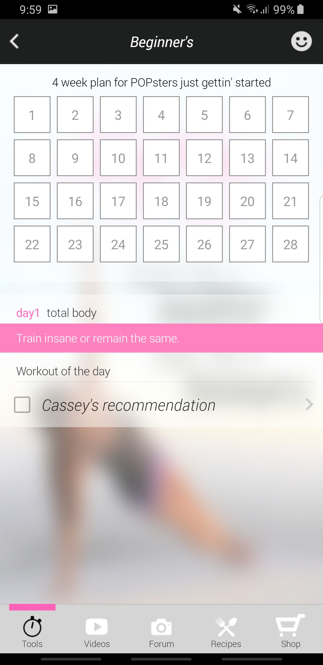
By analyzing these apps, I made some notes about which designs and functions is effective. I also observed how the systems organized large amounts of data without looking cluttered and overwhelming.
Final Prototypes
Are you okay?
This prototype shows the condition check-in survey that the user would have to fill out before their workout
The user can choose to remove certain workouts if they have an injury that would prevent them to perform certain workouts
Find your perfect workout
This prototype shows how the filter search function works, and how the workouts would be displayed on the home page
Smartwatch Companion
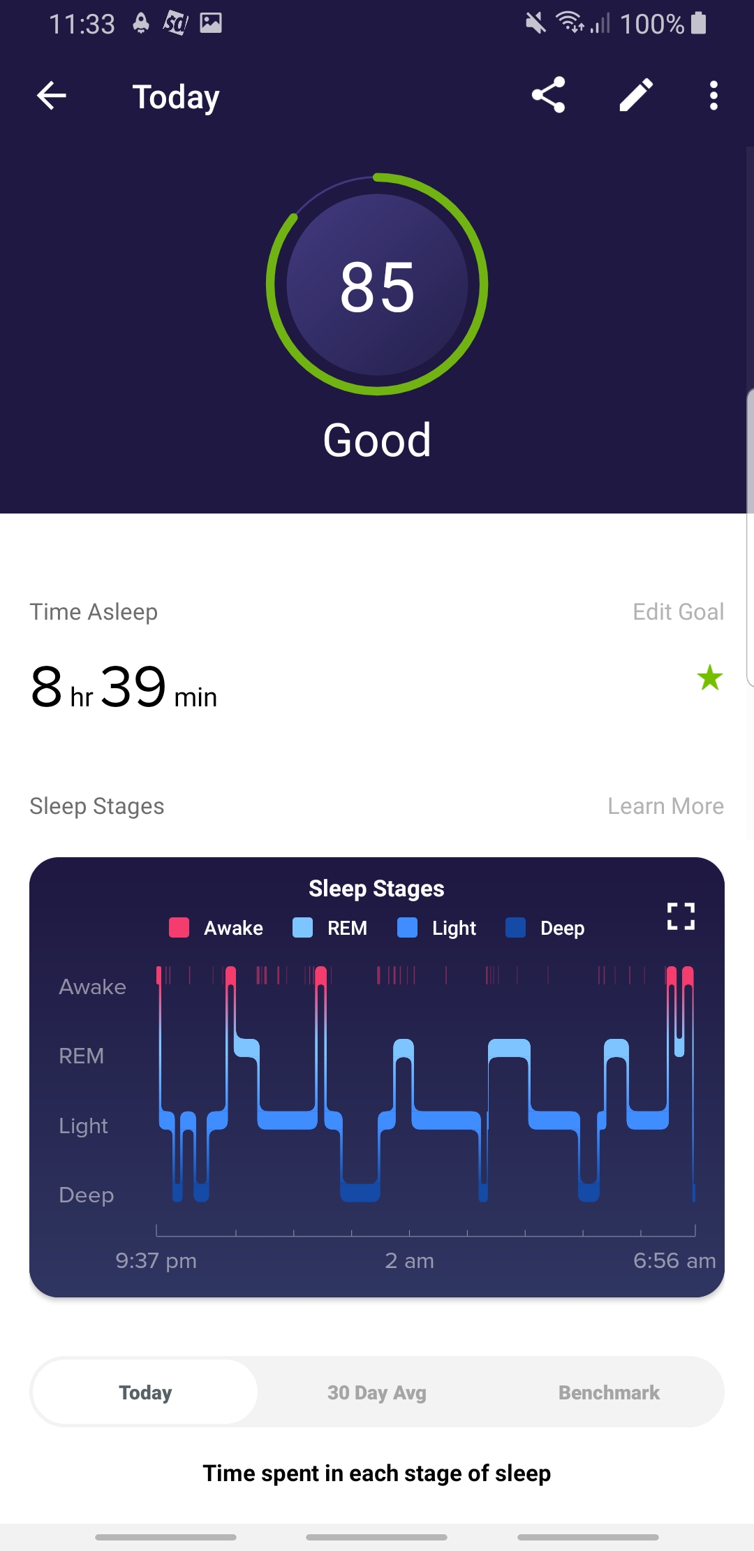
The user can use the smartwatch companion application to see their workout progress and set an interval timer