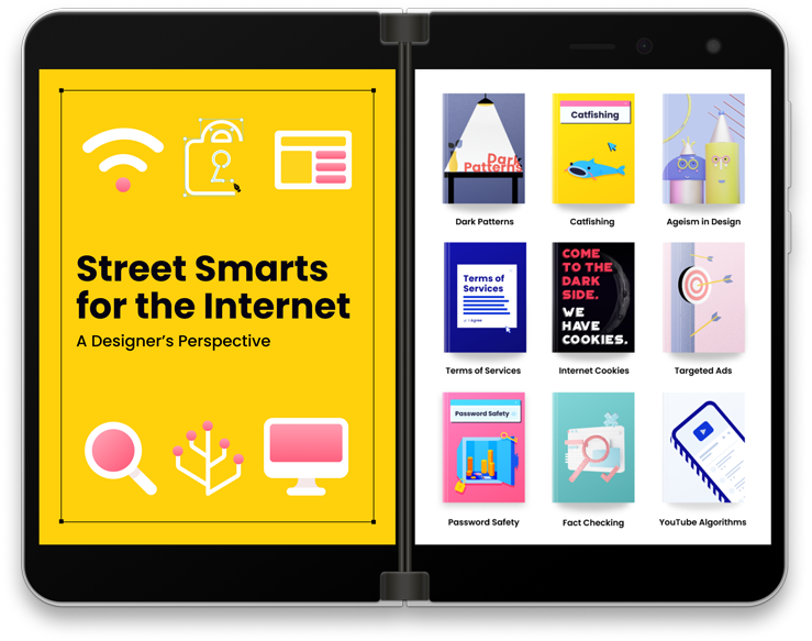
Street Smarts for the Internet
Duration SEP—DEC 2020
Project Type Group Project, UI/UX Design, Print Production
Tools Figma, Adobe After Effects, Adobe InDesign, Adobe Illustrator
A guidebook presenting dark patterns on the internet that some companies practice, and provides tips and tricks on how to avoid those practices safely.
Project Goal
Create spreads of information about design ethics that will be printed as a trade book/magazine and have an interactive aspect on digital media
My Topics
Terms of Services + YouTube Algorithms
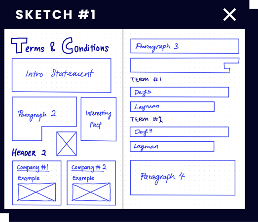
Terms of Services
Something that we all have to sign for whether it's using a new service or installing a new app. How many of us actually read through the contents before signing the contract?
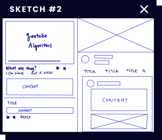
YouTube Algorithms
Sometimes we get good recommendations and sometimes we don't. However, the problem doesn't lie in the recommendations but in the potential danger of misinformation.
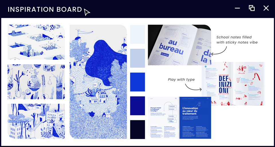
For my spreads, I decided to go with a blue-heavy color palette as it reminded me of filling out important documents.
As a team, we decided that using the same typeface throughout our design would help tie our designs together and give a sense of similarity despite our varied graphic styles.
Final Prints
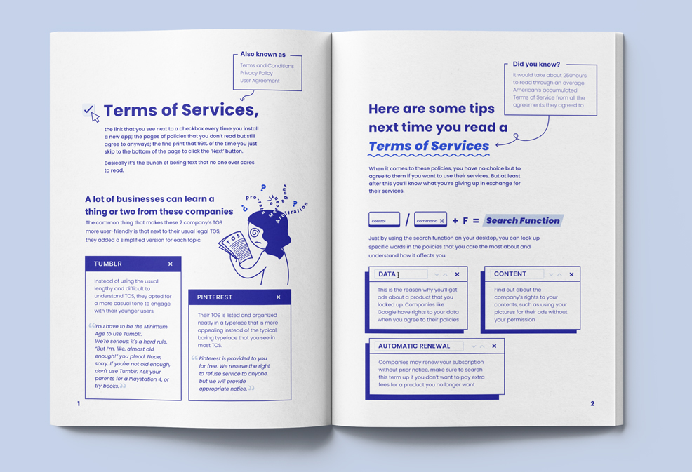
Terms of Services
A lot of companies don't put effort into making their terms of services easily comprehensible. In this spread, I gave a couple of examples of companies that included a simpler version of the contract next to the legal version.
A tip on how to quickly search for terms that we might be worried about when we agree to the contract is also included.
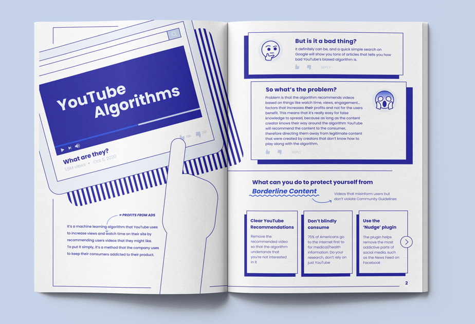
YouTube Algorithms
Nowadays, when someone is sick the first person they consult isn't a medical professional but the interwebs. This is where the potential danger lies due to medical misinformation.
The algorithm doesn't generate recommendations based on the well-being of the user but recommends videos that would generate higher profits for the company. If the viewer stumbles upon a video full of misinformation, it could lead to serious problems.
Digital Media
We decided to use Microsoft Surface Duo for the interactive/digital version of the magazine. We wanted to try out a new tech instead of using the usual tablets.
